Best practices for mobile form design in SharePoint
Build effective SharePoint forms with Nintex that are accessible anywhere, at any time, and on any device. You built the workflows, you built the forms, now make them mobile.
Mobilize your processes
Nintex Mobile apps help you get more from your business processes by allowing users to interact with them on-the-go. Nintex Mobile apps extend the promise of Workflow for Everyone to your mobile devices, improving the user-experience and enabling increased productivity for your whole organization quickly, easily and securely. You built the workflows, you built the forms, now make them mobile.
Nintex Mobile - Mobilize Your Processes
With Nintex Mobile you can interact securely with your processes from mobile devices
Where the experience starts: design your form with Nintex Forms
Nintex Mobile works together with Nintex Forms for SharePoint by extending access to available forms on your mobile device. SharePoint administrators can design forms visually with Nintex Forms, and, with a simple action, publish them for consumption on mobile devices, with the option of being able to choose the target platforms and form factors.
Forms published for Nintex Mobile Phone or Tablet layout are displayed in a native format to the mobile device selected and can be accessed offline, once the form definition has been downloaded on your mobile device. This happens automatically the first time you open the form on your mobile device. The advantages of using the Nintex Mobile apps and native form format over a generic HTML approach are:
· You want to publish multiple mobile forms and have your users access them from one single point, instead of distributing multiple URLs to separate forms.
· You want to allow users to fill in forms offline and attach files and images directly from the app.
· You want a fully integrated experience for your business processes, where forms and tasks can all be accessed in one single and consistent application.
As mentioned in my other article about Creating mobile accessible forms in SharePoint, Nintex Forms allows you to optimize the layout of mobile forms for phones (typically 4” –5” screen size) or tablets (7” – 10” screen size).
When designing forms for smartphones and tablets, you should take the opportunity to optimize and simplify the form layout for the specific mobile device.
Try to add value to the mobile experience by asking yourself questions such as:
· What is absolutely essential to submit when you’re on the move?
· What’s the best way to represent the form and information?
· Is it clear enough without too much explanation (i.e. reduced screen size may limit users’ ability to enter full-length explanations and descriptions of form fields).

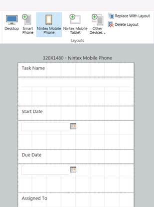
Mobile form optimized for a phone layout
A few best practices for designing effective mobile forms:
· Align labels and controls in a column, one beneath the other one when designing for phone view.
· Portrait mode usually works better with longer forms that require scrolling. In this case, we recommend one direction of scrolling (up and down).
· Save and Cancel buttons do not need to be placed on your form; the Nintex Mobile apps will do that for you automatically, by respecting the design guidelines of the mobile platform in use.
· Do not add images to the mobile form or specify background colour, unless really required. Keep your mobile forms lean and mean, the smaller the better. This results in quicker download times on a mobile device when connectivity is poor. Nintex Mobile will automatically optimize the layout and formatting of the form for the specific mobile platform.
· Use a Yes/No control instead of a Choice control with radio buttons when you require an “either/or” answer. Mobile devices render this type of control with a simple switch most users are familiar with, and the overall size of the form definition is smaller, which reduces download time on a mobile device.

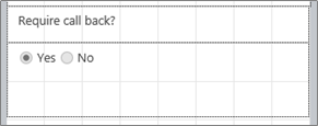
Use of Choice control with option buttons

Use of Yes/No control

The Yes/No control as rendered by Nintex Mobile
Categorize your forms
Forms created with Nintex Forms are displayed within a specific category in Nintex Mobile. I’d recommend assigning a category to forms, so they are easier to locate on the mobile app. To assign a category:
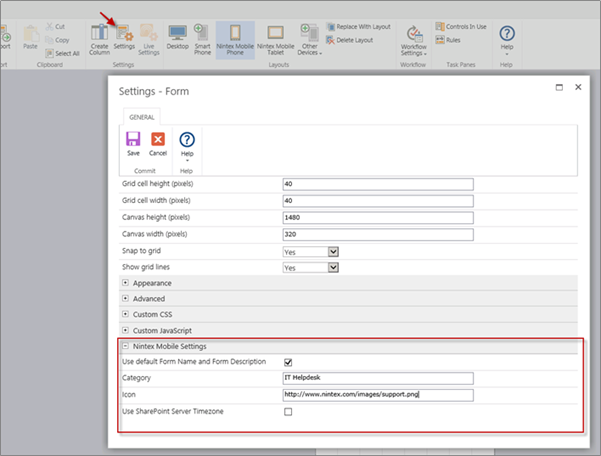
1. Click on Settings in the Ribbon.
2. Expand the Nintex Mobile Settings section and specify the category of the form. Forms without an assigned category will be displayed in Nintex Mobile under the “No Category” group.
In the same section, it is also possible to specify a form name and description for mobile use. Uncheck the Use default Form Name and Form Description options, and enter the preferred name and description in the appropriate fields.
The name and description entered here will override the default values of the SharePoint form, and will be used instead by Nintex Mobile.
To personalize further your forms, it is also possible to specify a custom icon that is displayed in Nintex Mobile next to the form name. It is necessary that the icon is accessible by your SharePoint server, so you need to specify the icon’s full URL in the Icon field.
The form icon is exposed in three places:
1. App in Full Screen: displayed dimension is 62 by 62 pixels
2. App in Snapped View: displayed dimension is 42 by 42 pixels
3. The Start Screen when you pin a form: displayed dimension is 150 by 150 pixels
The recommended dimension of the icon is 150x150 pixels. This will scale down to the other sizes.

The Nintex Mobile Settings section in the form’s Settings page
That’s all for now. In the next article, I’ll describe how to mobilize your forms for SharePoint workflow and provide a seamless experience to your users at any stage of a business process, anywhere and on any device.
When creating an MVC application with Entity Framework, it is possible to set default values for most properties in a model using the DefaultValue attribute. However, no much flexibility is offered for a DateTime property. This article presents a custom validation attribute for DateTime types that accepts different formats for defining the default value of the property.
How I built a social sharing component for my own web site and added a secured geo-located audit trail. Step by step, let’s analyse technologies and source code for developing this component.
How I built a social sharing component for my own web site and added a secured geo-located audit trail. Step by step, let’s analyse technologies and source code for developing this component.
With just over 3 weeks to go to Europe's largest gathering of SharePoint & Office 365 professionals, take a look at these tips that will help you get the most out of ESPC16…
Learn how to write code to perform basic operations with the SharePoint 2013 .NET Framework client-side object model (CSOM), and build an ASP.NET MVC application that retrieves information from a SharePoint server.
What are the synergies and differences of the roles of a Chief Information Officer and a Chief Technology Officer? An open conversation about two roles with one mission…
Whether you are a software developer, tester, administrator or analyst, this article can help you master different types of UI testing of an MVC application, by using Visual Studio for creating coded UI test suites that can be automated for continuous execution.
Different formats and standards exist for describing geographical coordinates in GIS systems and applications. This article explains how to convert between the most used formats, presenting a working library written in C#.
With the release of the Nintex Mobile apps, SharePoint users can now optimise their experience across popular mobile devices and platforms.
Performance Testing is an essential part of software testing, with the specific goal of determining how a system performs in terms of responsiveness and stability under a particular workload. In this series of posts we’ll define and execute a good strategy for testing performance of an application using Visual Studio.
Can you generate two identical GUIDs? Would the world end if two GUIDs collide? How long does it take to generate a duplicate GUID and would we be still here when the result is found?
A design paper about implementing GIS-based services for a local Council in Dynamics CRM, structuring address data, and delivering location services in the form of WebAPI endpoints via an Enterprise Service Bus.
All teams are groups but not all groups are teams. What defines a group and what a team? When do we need one over the other one?
Learning to give and receive constructive feedback is an essential part of learning, growing, improving and achieving our goals.
Have you ever wanted to see your iPhone or iPad on a larger screen? Play games, watch movies, demo apps or present to your computer from your iPhone or iPad. Reflector mirrors iOS devices on big screens wirelessly using iOS built-in AirPlay mirroring.
Build workflow applications in SharePoint that can be accessed on mobile devices using the Nintex solution for business process mobilization.
Have you ever desired to have in your code a way to order a sequence of strings in the same way as Windows does for files whose name contains a mix of letters and numbers? Natural string sorting is not natively supported in .NET but can be easily implemented by specialising a string comparer and adding a few extensions to the enumerable string collection.
How can an organisation optimise its sales channels and product targeting by building a 365-degree view of its customers in Dynamics CRM? The answer, and topic of this article, is with the help of Azure IoT and Machine Learning services!
This article presents design best practices and code examples for implementing the Azure Redis Cache and tuning the performance of ASP.NET MVC applications, optimising cache hit ratio and reducing “miss rate” with smart algorithms processed by Machine Learning.
What it takes to be a great Software Development Manager? I have been building software for the last 15 years and have collected a few stories and experiences to share. Some I have used as questions when interviewing candidates. In 11 points, this is my story to date.
Practical code examples of ASP.NET MVC applications that connect to a SharePoint Server and comply with the SOLID principles.
Outsourcing may look financially attractive, but working with companies in far-off lands introduces challenges that, if not considered properly, can drive any project to failure. Let’s explore some common pitfalls when working with offshore partners and a common-sense approach to work around them.
Customers expect a modern approach to advertising. Digital advertising can leverage evolving technology to provide just-in-time, just-at-the-right-place promotions.
There is an urban myth in the programmers’ community that the so called “Yoda’s syntax” performs better when checking an object for nullity. Let's demystify it...

