Creating mobile accessible forms in SharePoint
With the release of the Nintex Mobile apps, SharePoint users can now optimise their experience across popular mobile devices and platforms.
Welcome Nintex Mobile
With the first release of the Nintex Mobile apps for iPhone, iPad and Windows 8, SharePoint users can now optimise their experience across popular mobile devices and platforms.
The apps are developed natively for the relevant mobile platforms, using Objective-C and C# as programming languages.
By being “native” to the platform, the apps can take advantage of the best features of your mobile hardware and software, including camera, GPS, NFC, gesture and offline mode.
Nintex Mobile - Optimize Experience Across Popular Mobile Devices and Platforms
Nintex Mobile helps keep processes moving
Operating System Requirements
Nintex Mobile apps version 1.0 can be installed on devices running any of the following operating systems:
· Microsoft Windows 8 for x86 platforms (32 and 64 bit) or ARM (e.g. Microsoft Surface).
· Apple iOS 5 or greater for iPhone, iPad or iPod.
Software Requirements
If you are using Microsoft SharePoint 2013, Nintex Mobile apps version 1.0 require the following versions of Nintex Workflow and Nintex Forms installed and configured.
· Nintex Forms 2013 version 2.1.1.0
· Nintex Workflow 2013 version 3.0.3.0
If you are using Microsoft SharePoint 2010, Nintex Mobile apps require the following versions of Nintex Workflow and Nintex Forms installed and configured.
· Nintex Forms 2010 version 1.3
· Nintex Workflow 2010 version 2.3.9
Creating a mobile apps accessible form
The process for designing a mobile form in SharePoint is completely visual and it starts in Nintex Forms.
First, we need to create a new SharePoint custom list app (I assume we’re working with SharePoint 2013 now), and then open it in Nintex Forms (click the List tab and select Nintex Forms in the ribbon).
The Nintex Form designer will open and the form has already been created for the desktop layout, displaying the relevant controls for each column in the list.
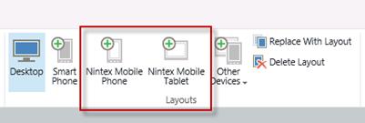
It is now possible to add two layouts to the current form, for making it available on the Nintex Mobile apps:
· Nintex Mobile Phone
· Nintex Mobile Tablet
As the name suggests, the Nintex Mobile Phone layout is designed for phone devices, whereas the Nintex Mobile Tablet one is the layout used by the Nintex Mobile apps to display the form on a tablet.

From here, the experience of designing a form for mobile devices using Nintex Forms remains the same as for the desktop layout. There are however a few best practices to follow for making the best of mobile forms on your device.
Specifically, the following list details the supported controls in Nintex Forms that can be used when designing a mobile form:
· Choice
· Date/Time
· Label
· Multi Line Textbox
· Single Line Textbox
· Yes/No
Please note: Controls besides the ones mentioned above are not currently supported by the Nintex Mobile apps. Unsupported controls will still appear in the Nintex Forms Control Toolbox, but will not display on the mobile device.
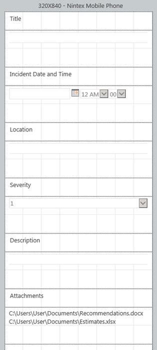
When choosing the Nintex Mobile Phone layout, the form will look similar to the screenshot below.

You may want to rearrange the controls to ensure they fit correctly onscreen. For a phone layout, the recommendation is to line up labels and controls one under the other one, and occupy the full extent of the screen for each control. I’ll present additional best practices and recommendations for designing mobile forms in a new article.
My Forms
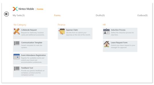
Once published, this form is immediately available for being displayed within the Nintex Mobile apps. After signing in to Nintex Mobile with your account, the Forms page displays a list of all available forms created with Nintex Forms and published on the SharePoint server to which you are connected.
Forms are sorted by category, as specified in the Nintex Mobile Settings of a form, and by name within a category. If no category is specified, forms are assigned to the fictitious “No Category” and displayed before any other categorized forms.

If you are using the Nintex Mobile app for Windows, categories are represented as separate columns, under which forms are listed in alphabetical order. If the number of forms for each category exceeds the maximum number of consecutive forms that is possible to display in a column, additional forms span over adjacent columns. It is also possible to remove the grouping of categories in column format and move to an “in line” categorization of forms that does not create visual separation of categories by column.
This option is recommended when a large number of forms is available (more than 100), as performance is greatly improved. You can activate this option from the Settings panel, Options > Enable item grouping.
In the next article, I’ll present more advanced techniques for better controlling the layout of mobile forms and get the most of the available controls in Nintex Forms for SharePoint.
When creating an MVC application with Entity Framework, it is possible to set default values for most properties in a model using the DefaultValue attribute. However, no much flexibility is offered for a DateTime property. This article presents a custom validation attribute for DateTime types that accepts different formats for defining the default value of the property.
How I built a social sharing component for my own web site and added a secured geo-located audit trail. Step by step, let’s analyse technologies and source code for developing this component.
How I built a social sharing component for my own web site and added a secured geo-located audit trail. Step by step, let’s analyse technologies and source code for developing this component.
Build effective SharePoint forms with Nintex that are accessible anywhere, at any time, and on any device. You built the workflows, you built the forms, now make them mobile.
With just over 3 weeks to go to Europe's largest gathering of SharePoint & Office 365 professionals, take a look at these tips that will help you get the most out of ESPC16…
Learn how to write code to perform basic operations with the SharePoint 2013 .NET Framework client-side object model (CSOM), and build an ASP.NET MVC application that retrieves information from a SharePoint server.
What are the synergies and differences of the roles of a Chief Information Officer and a Chief Technology Officer? An open conversation about two roles with one mission…
Whether you are a software developer, tester, administrator or analyst, this article can help you master different types of UI testing of an MVC application, by using Visual Studio for creating coded UI test suites that can be automated for continuous execution.
Different formats and standards exist for describing geographical coordinates in GIS systems and applications. This article explains how to convert between the most used formats, presenting a working library written in C#.
Performance Testing is an essential part of software testing, with the specific goal of determining how a system performs in terms of responsiveness and stability under a particular workload. In this series of posts we’ll define and execute a good strategy for testing performance of an application using Visual Studio.
Can you generate two identical GUIDs? Would the world end if two GUIDs collide? How long does it take to generate a duplicate GUID and would we be still here when the result is found?
A design paper about implementing GIS-based services for a local Council in Dynamics CRM, structuring address data, and delivering location services in the form of WebAPI endpoints via an Enterprise Service Bus.
All teams are groups but not all groups are teams. What defines a group and what a team? When do we need one over the other one?
Learning to give and receive constructive feedback is an essential part of learning, growing, improving and achieving our goals.
Have you ever wanted to see your iPhone or iPad on a larger screen? Play games, watch movies, demo apps or present to your computer from your iPhone or iPad. Reflector mirrors iOS devices on big screens wirelessly using iOS built-in AirPlay mirroring.
Build workflow applications in SharePoint that can be accessed on mobile devices using the Nintex solution for business process mobilization.
Have you ever desired to have in your code a way to order a sequence of strings in the same way as Windows does for files whose name contains a mix of letters and numbers? Natural string sorting is not natively supported in .NET but can be easily implemented by specialising a string comparer and adding a few extensions to the enumerable string collection.
How can an organisation optimise its sales channels and product targeting by building a 365-degree view of its customers in Dynamics CRM? The answer, and topic of this article, is with the help of Azure IoT and Machine Learning services!
This article presents design best practices and code examples for implementing the Azure Redis Cache and tuning the performance of ASP.NET MVC applications, optimising cache hit ratio and reducing “miss rate” with smart algorithms processed by Machine Learning.
What it takes to be a great Software Development Manager? I have been building software for the last 15 years and have collected a few stories and experiences to share. Some I have used as questions when interviewing candidates. In 11 points, this is my story to date.
Practical code examples of ASP.NET MVC applications that connect to a SharePoint Server and comply with the SOLID principles.
Outsourcing may look financially attractive, but working with companies in far-off lands introduces challenges that, if not considered properly, can drive any project to failure. Let’s explore some common pitfalls when working with offshore partners and a common-sense approach to work around them.
Customers expect a modern approach to advertising. Digital advertising can leverage evolving technology to provide just-in-time, just-at-the-right-place promotions.
There is an urban myth in the programmers’ community that the so called “Yoda’s syntax” performs better when checking an object for nullity. Let's demystify it...

